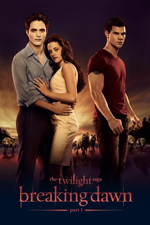
The Twilight Saga: Breaking Dawn – Part 1 (2011) colour palette
Directed by Bill Condon · Shot by Guillermo Navarro
The main colours of The Twilight Saga: Breaking Dawn – Part 1 (2011) are deep red (#241a17), deep orange (#493932) and pale orange (#f9f7f6), over a near-black base: a strongly warm, muted palette, measured across the film's frames.
- #302f2edark grey · 13.3%
- #100f0enear black · 7%
- #241a17deep red · 6%
- #493932deep orange · 5.3%
- #51504bdark grey · 5.3%
- #f9f7f6pale orange · 4.3%
The Twilight Saga: Breaking Dawn – Part 1 (2011), shot by Guillermo Navarro, runs muted and strongly warm, measured across 60 sampled frames. Its two dominant hue families are orange and red. The single most common colour is dark grey (#302f2e), covering 13.3% of sampled colour. Overall the image sits mid-key.
Warmth
strongly warm
0.714 on −1 cool to +1 warm
Saturation
muted
0.206 — more saturated than 28% of ranked films
Luminance
mid-key
0.401 — brighter than 40% of ranked films
Measured across 60 frames. See the frames on the The Twilight Saga: Breaking Dawn – Part 1 page →
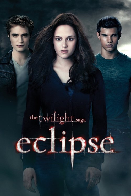
Other The Twilight Saga films
The rest of the series, each measured on its own — this page is The Twilight Saga: Breaking Dawn – Part 1 (2011).


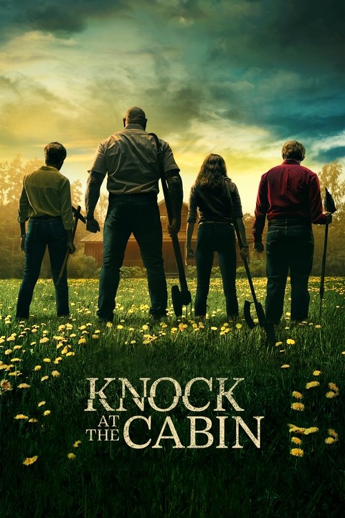
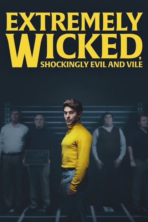
Films that grade like this
Nearest by warmth, saturation and luminance across 1,568 ranked films — measured, not matched on genre.


Search the frames behind The Twilight Saga: Breaking Dawn – Part 1
Every colour here comes from a real frame. Search by colour, lighting, lens and mood. Free account: 10 searches a day and 5 downloads a week, no card.
These measurements are published under CC BY 4.0 with attribution to FrameThrower. That covers the measurements only — the frames they were derived from are not ours to license, and rights remain with their owners.