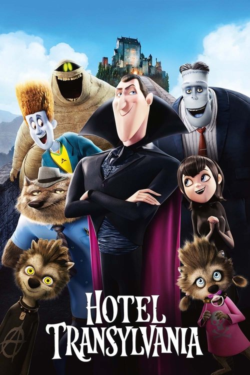
Hotel Transylvania colour palette
Directed by Genndy Tartakovsky
The main colours of Hotel Transylvania are deep blue (#13172c) and deep magenta (#291a2c), over a near-black base: a warm, natural palette, measured across the film's frames.
- #312c2ddark grey · 6.7%
- #0e0c0enear black · 5%
- #13172cdeep blue · 3.7%
- #2c3348deep blue · 3.7%
- #57514ddark grey · 3%
- #291a2cdeep magenta · 3%
Hotel Transylvania runs natural and warm, measured across 60 sampled frames. Its two dominant hue families are orange and blue. The single most common colour is dark grey (#312c2d), covering 6.7% of sampled colour. Overall the image sits mid-key.
Warmth
warm
0.309 on −1 cool to +1 warm
Saturation
natural
0.366 — more saturated than 87% of ranked films
Luminance
mid-key
0.421 — brighter than 55% of ranked films
Measured across 60 frames. See the frames on the Hotel Transylvania page →
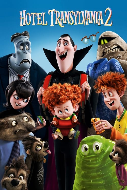
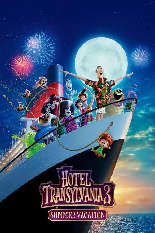
Other Hotel Transylvania films
The rest of the series, each measured on its own — this page is Hotel Transylvania.

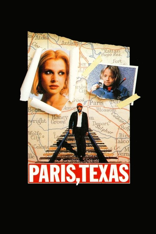
Films that grade like this
Nearest by warmth, saturation and luminance across 1,568 ranked films — measured, not matched on genre.


Search the frames behind Hotel Transylvania
Every colour here comes from a real frame. Search by colour, lighting, lens and mood. Free account: 10 searches a day and 5 downloads a week, no card.
These measurements are published under CC BY 4.0 with attribution to FrameThrower. That covers the measurements only — the frames they were derived from are not ours to license, and rights remain with their owners.