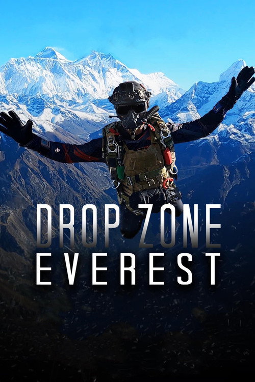
Drop Zone Everest (2023) colour palette
Directed by Mike Tamzil
- #f9f9f8near white · 11.1%
- #323230dark grey · 8.9%
- #d0d0celight grey · 8.1%
- #50514edark grey · 5.8%
- #8e908bmid grey · 4.7%
- #a7aaa9light grey · 4.2%
Drop Zone Everest (2023) runs muted and warm, measured across 106 sampled frames. Its two dominant hue families are orange and blue. The single most common colour is near white (#f9f9f8), covering 11.1% of sampled colour. Overall the image sits bright.
Warmth
warm
0.268 on −1 cool to +1 warm
Saturation
muted
0.19 — more saturated than 21% of ranked films
Luminance
bright
0.539 — brighter than 98% of ranked films
Measured across 106 frames. See the frames on the Drop Zone Everest page →
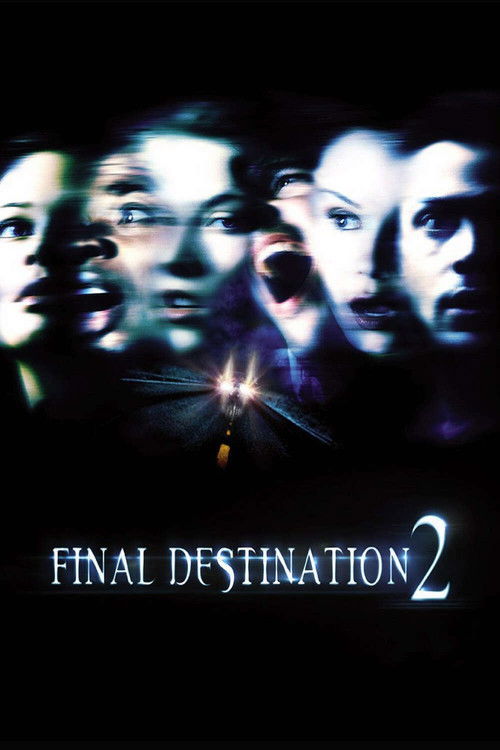
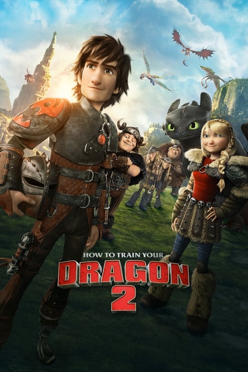
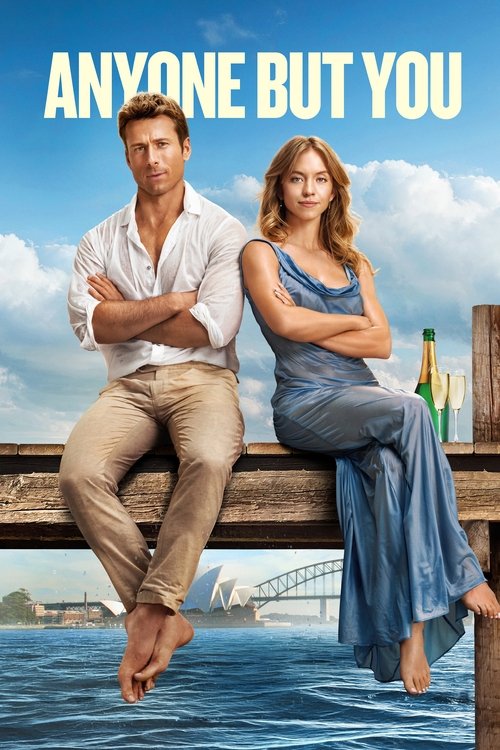
Films that grade like this
Nearest by warmth, saturation and luminance across 1,568 ranked films — measured, not matched on genre.
Search the frames behind Drop Zone Everest
Every colour here comes from a real frame. Search by colour, lighting, lens and mood — $2 of credits free, no card.
These measurements are published under CC BY 4.0 with attribution to FrameThrower. That covers the measurements only — the frames they were derived from are not ours to license, and rights remain with their owners.