
Iconic film stills
Nineteen images the canon already agrees on — and what actually makes each one a landmark, in craft terms rather than adjectives. An iconic still is rarely the prettiest frame in its film. It is the one where a technique becomes legible.
Each entry carries the measured colour of the film behind it — warmth, saturation and luminance from FrameThrower's own per-frame extraction, so the claim about the look can be checked rather than taken. How the measurements work → Deliberately unranked.
- 01
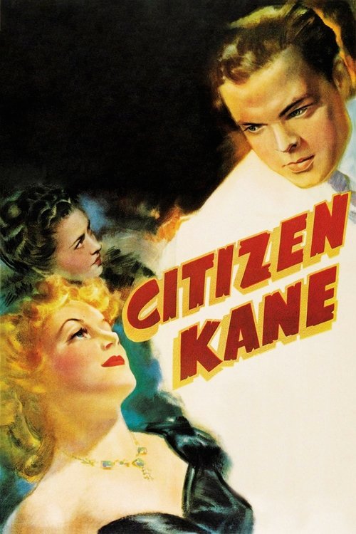
Citizen Kane (1941)
Orson Welles · shot by Gregg Toland
Kane dwarfed by his own fireplace; the boy visible through the window while his future is signed away in the foreground.
Deep focus as an argument rather than a trick. Toland kept the foreground and the far background both sharp so the frame could hold two dramatic planes at once — you are made to watch a decision and its consequence simultaneously, without a cut.
Measured: Monochrome — 0.001 mean saturation, so it is built entirely from tonal separation. Its dominant value is near black at 20% of sampled colour.
- 02
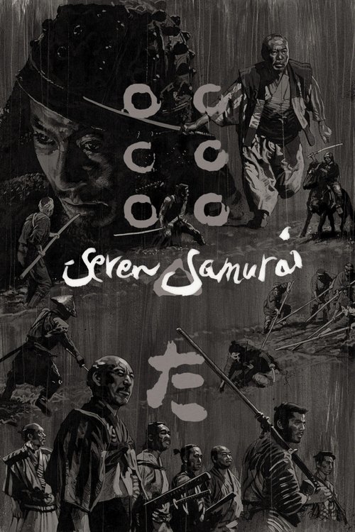
Seven Samurai (1954)
Akira Kurosawa · shot by Asakazu Nakai
The final battle in the rain and mud, bodies and horses cutting across a flattened grey field.
Multiple cameras with long lenses, so the action could be covered without staging it twice — and telephoto compression that stacks figures into a single churning plane. Most modern action coverage is still a variation on this.
Measured: Monochrome. Mid-grey dominant at 0.428 luminance — deliberately flatter than Kane, which is what lets rain and dust read as texture.
- 03
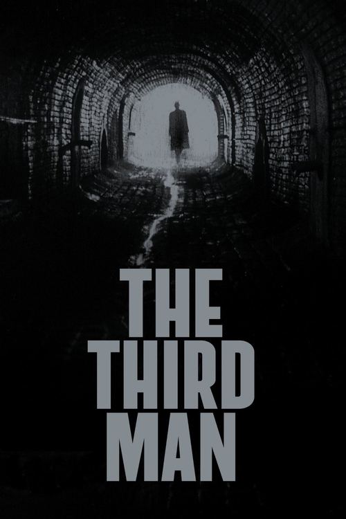
The Third Man (1949)
Carol Reed · shot by Robert Krasker
Harry Lime lit by a suddenly-opened window in a Vienna doorway; wet cobbles and canted frames.
The Dutch angle used relentlessly enough to become the film's posture rather than a flourish, and hard single-source light on wet stone — the sharpest possible contrast, which is what makes the frames legible as graphics.
Measured: Monochrome at exactly 0.0 saturation, with near-black at 0.414 mean luminance. As black-and-white as anything in the catalogue.
- 04
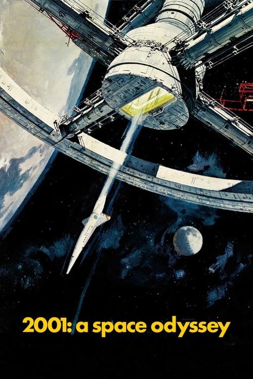
2001: A Space Odyssey (1968)
Stanley Kubrick · shot by Geoffrey Unsworth
The one-point corridor. HAL's lens. The bone against the sky.
Symmetry treated as a subject. Kubrick centres a vanishing point and lets the architecture do the acting, which is why a single frame reads as a whole idea — and why the composition is imitated more than any other in the medium.
Measured: Its two dominant colours are near black and near white — 0.35 saturation with orange and blue families, a colour film that keeps reaching for monochrome contrast.
- 05
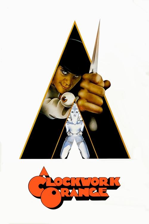
A Clockwork Orange (1971)
Stanley Kubrick · shot by John Alcott
Alex at the Korova Milk Bar, one eye lashed, staring down the barrel of the lens.
The direct-address stare plus a wide lens close enough to distort. It breaks the rule that the camera is unacknowledged, and the discomfort is entirely a lens-and-eyeline decision.
Measured: The brightest film in this set at 0.495 mean luminance — the glare is measurable, not just remembered.
- 06
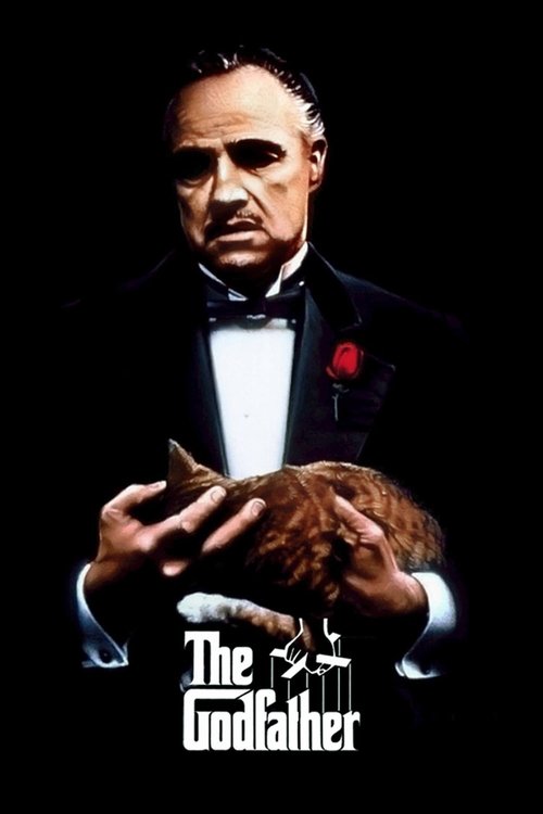
The Godfather (1972)
Francis Ford Coppola · shot by Gordon Willis
Vito in his study, eyes lost in shadow under a hard top light.
Willis exposed for the practical and let the eyes fall into darkness — at the time considered a mistake, now the reference for moral ambiguity rendered as exposure. Underexposure as characterisation.
Measured: Warmth 0.962, the warmest colour film in this selection, at only 0.23 saturation. Amber and dark, exactly as described.
- 07
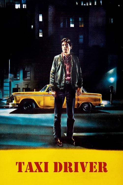
Taxi Driver (1976)
Martin Scorsese · shot by Michael Chapman
Neon bleeding through a wet windscreen; Travis in the mirror.
Smeared practical light shot through glass and rain, so the city arrives as refraction rather than as a place. The subjective camera made out of nothing but a windscreen and a long lens.
Measured: Warmth 0.776 with red and orange families — the sodium-and-neon palette measured rather than asserted.
- 08
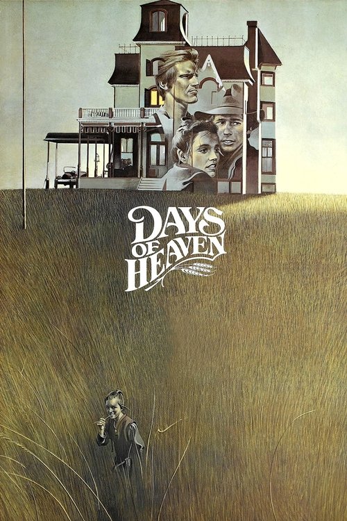
Days of Heaven (1978)
Terrence Malick · shot by Néstor Almendros
Figures in wheat at last light; the house alone on the horizon.
Shot almost entirely in the twenty minutes after sunset. Almendros refused fill and let faces go dark against a bright sky — the argument that natural light is a schedule constraint, not a lighting plan.
Measured: Warmth 0.796 with orange and blue families, the classic magic-hour split of a warm subject against a cooling sky.
- 09
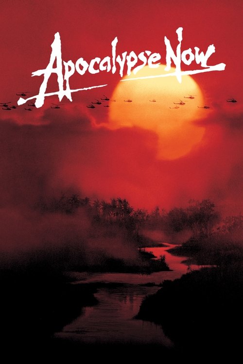
Apocalypse Now (1979)
Francis Ford Coppola · shot by Vittorio Storaro
Willard rising from the water in green and orange; helicopters against a burning treeline.
Storaro colours by meaning rather than by realism — warm for the world of the living, cold for what is beyond it. Colour used as an explicit language, which almost nothing before it attempted at this scale.
Measured: Warmth 0.825 at 0.362 saturation, and among the darker films here at 0.346 luminance. Hot and dim at the same time — hard to achieve, and the reason it looks like nothing else.
- 10
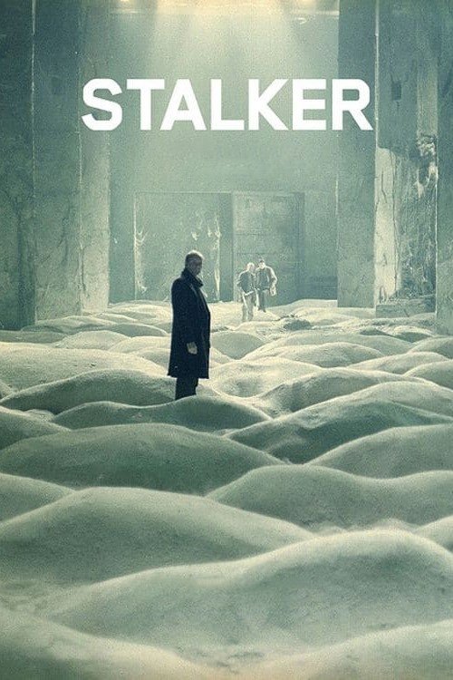
Stalker (1979)
Andrei Tarkovsky · shot by Aleksandr Knyazhinsky
The sepia world outside the Zone; the drowned room; water over tiles.
Colour withheld, then given. The switch between sepia and colour is the film's whole structure — and the sepia is not a filter but a controlled desaturation that still carries warmth.
Measured: Warmth 0.86 at just 0.139 saturation — the most extreme warm-but-desaturated combination in this set, which is precisely what sepia is.
- 11
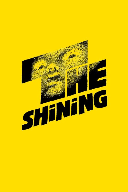
The Shining (1980)
Stanley Kubrick · shot by John Alcott
Danny on the tricycle down the corridor; the twins; the flooded lift.
Early Steadicam at floor height, gliding rather than walking. The camera moves with a smoothness no human gait produces, which is what makes an empty hotel corridor feel occupied.
Measured: Warmth 0.624 at 0.446 luminance — brighter than most horror, which is the point. The Overlook is lit like a hotel, not a haunted house.
- 12
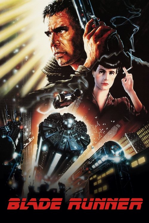
Blade Runner (1982)
Ridley Scott · shot by Jordan Cronenweth
Shafts of light through venetian blinds and smoke; the eye reflecting a city on fire.
Hard beams made visible by atmosphere, so light becomes an object in the frame rather than a condition of it. Every rain-and-neon future since is downstream of these frames.
Measured: The only film in this selection measuring COOL — warmth −0.241, cyan and orange families, at 0.322 luminance. The teal-and-orange grade, twenty years before it was a cliché.
- 13
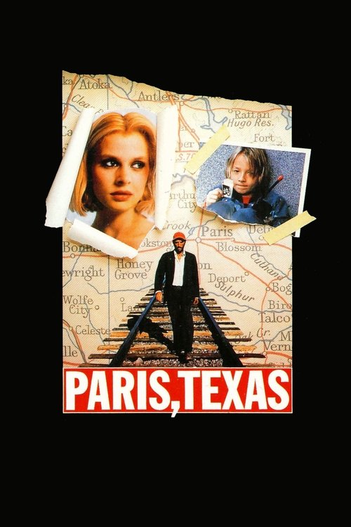
Paris, Texas (1984)
Wim Wenders · shot by Robby Müller
A red cap against desert rock; the peep-show booth in green and pink, two faces in one pane of glass.
Müller lit interiors with saturated practical colour long before it was fashionable, and let exteriors be simply, brutally bright. The booth scene stages a conversation as a single reflected composition — two people in one frame who cannot see each other.
Measured: The most saturated film in this set after Do the Right Thing, at 0.394 — those reds and greens are measurably there.
- 14
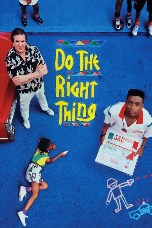
Do the Right Thing (1989)
Spike Lee · shot by Ernest R. Dickerson
Radio Raheem head-on in hot orange; the block in unbroken summer glare.
Dickerson pushed warmth and saturation deliberately to make heat a character. Combined with Lee's low-angle direct address, the frames feel confrontational by construction rather than by content.
Measured: Saturation 0.547 — the most saturated film in this entire selection — with warmth 0.861. The heat is in the numbers.
- 15
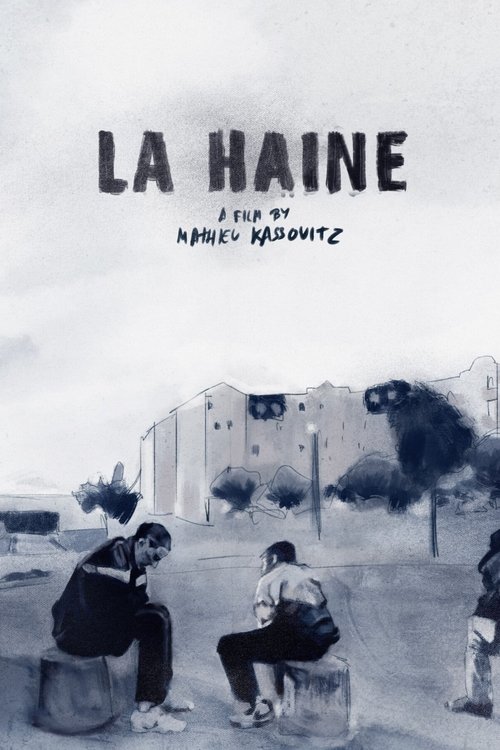
La Haine (1995)
Mathieu Kassovitz · shot by Pierre Aïm
Three friends against the banlieue; the mirror monologue; wide black-and-white streets.
Monochrome chosen in 1995, when it read as a documentary claim rather than nostalgia, and wide lenses close to faces so the estate is always present behind them.
Measured: Monochrome at 0.0 saturation and 0.45 luminance — noticeably brighter than the older black-and-white films here, which is what makes it feel contemporary rather than archival.
- 16
Chungking Express (1994)
Wong Kar-Wai · shot by Christopher Doyle
Step-printed blur through a crowd; a woman still while the world smears past.
Step printing — shooting at a low frame rate and printing frames repeatedly — so movement stutters and the still centre of a frame is the person not moving. Motion used to isolate rather than to energise.
Measured: Blue and orange families at 0.455 luminance, the brightest of the Wong Kar-Wai pair here. Daylight Hong Kong, not the night film people remember.
- 17
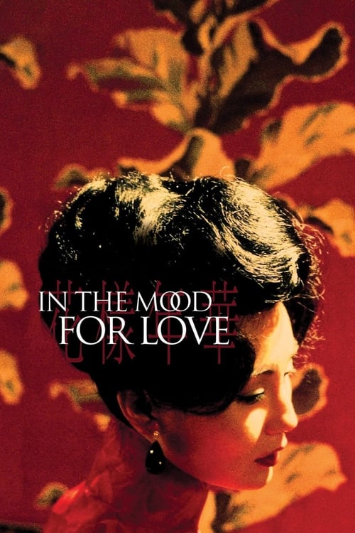
In the Mood for Love (2000)
Wong Kar-Wai · shot by Christopher Doyle
Two figures passing in a corridor, framed through a doorway; the noodle stall stairs.
Obstructed framing as a rule — doorways, windows, mirrors, always something between camera and subject. The audience is placed as an eavesdropper, and the restraint of the film is entirely a staging decision.
Measured: Warmth 0.816 with yellow and orange families at 0.218 saturation — muted and warm, the tungsten interior look it is imitated for.
- 18
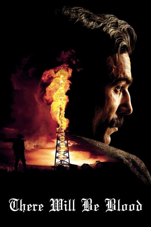
There Will Be Blood (2007)
Paul Thomas Anderson · shot by Robert Elswit
The derrick burning against a black sky; Plainview alone in a vast frame.
Wide lenses at distance, holding a figure small in a landscape long enough to become uncomfortable. The film refuses the close-up at exactly the moments most films would cut to one.
Measured: Warmth 0.69 with orange and blue families — the fire-against-cold-sky contrast, at a restrained 0.221 saturation.
- 19
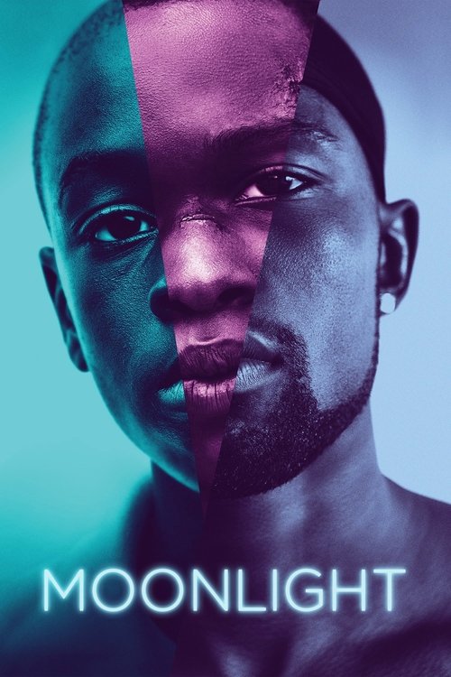
Moonlight (2016)
Barry Jenkins · shot by James Laxton
Blue-lit faces on a beach at night; Chiron looking directly into the lens.
Laxton pushed skin tones warm against deliberately cyan surroundings, and Jenkins put the camera at eye level for direct address. The frames make intimacy structural rather than sentimental.
Measured: Warmth 0.184 — nearly balanced — with orange and blue families. That near-zero warmth is the measurable signature of warm skin against cool night.
Find frames like these
Search 5,489 films by lighting, lens character, shot size, colour and mood. $2 of credits free, no card.
Common questions
- What makes a film still iconic?
- Recognition on its own, away from the film — and usually one decision taken further than anyone had taken it before. Deep focus in Citizen Kane, unlit eyes in The Godfather, hard beams through smoke in Blade Runner. An iconic still is rarely the prettiest frame in its film; it is the one where a technique becomes legible.
- What is the most famous film still of all time?
- There is no settled answer, and any list claiming one is expressing a preference. The images most often reproduced include Kane against his fireplace, the one-point corridors of 2001, Alex staring down the lens in A Clockwork Orange, and Willard rising from the water in Apocalypse Now. This page deliberately does not rank them.
- Can I use iconic film stills in a moodboard or lookbook?
- Using them as reference in a pitch document is normal industry practice, and crediting each frame to its film is the expected courtesy. Publishing or distributing them is a different question and is the rights holder's decision. FrameThrower shows frames at reduced resolution as references for commentary, education and study; rights remain with their owners.
- How were the colour measurements on this page calculated?
- Every frame in the FrameThrower library carries five extracted colours. Pooled per film, they give the dominant palette, plus warmth (−1 cool to +1 warm, weighted by saturation so grey pixels do not vote), mean saturation and mean luminance. Black-and-white films have no warmth by construction and are reported as monochrome rather than given a fabricated number.
- Where can I find more stills from these films?
- Each entry links to that film's page, which holds the frames FrameThrower indexes for it — searchable by lighting, lens character, shot size, camera angle, colour and mood alongside 5,489 other films.
More: measured colour palettes · the stills database · cinematography techniques · film lookbooks