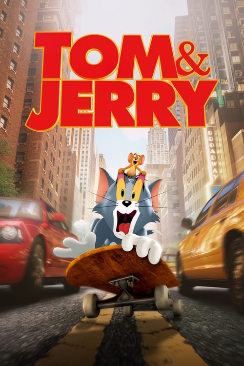
Tom & Jerry (2021) colour palette
Directed by Tim Story · Shot by Alan Stewart
- #303031dark grey · 11%
- #f7f6f4pale orange · 10.2%
- #d4d2cdlight grey · 4.6%
- #08090anear black · 3.4%
- #ab8f70orange · 3.1%
- #515050dark grey · 3.1%
Tom & Jerry (2021), shot by Alan Stewart, runs muted and warm, measured across 143 sampled frames. Its two dominant hue families are orange and blue. The single most common colour is dark grey (#303031), covering 11% of sampled colour. Overall the image sits bright.
Warmth
warm
0.509 on −1 cool to +1 warm
Saturation
muted
0.276 — more saturated than 61% of ranked films
Luminance
bright
0.521 — brighter than 97% of ranked films
Measured across 143 frames. See the frames on the Tom & Jerry page →
Films that grade like this
Nearest by warmth, saturation and luminance across 1,568 ranked films — measured, not matched on genre.

Search the frames behind Tom & Jerry
Every colour here comes from a real frame. Search by colour, lighting, lens and mood — $2 of credits free, no card.
Sign up for freeThese measurements are published under CC BY 4.0 with attribution to FrameThrower. That covers the measurements only — the frames they were derived from are not ours to license, and rights remain with their owners.